Summary
Designing a pocket folder in Canva requires more setup than a standard print file. Before you start, you'll need a flat dieline from your printer to understand how the canvas maps to the finished folded product. From there, it's a matter of setting up bleed, building out each panel with the right content, respecting the pocket flap zone, and exporting a print-ready PDF with crop marks. Planning your insert stack before you finalize the design helps you choose the right folder configuration from the start.
| Time to Read | 5-6 minutes |
| What You'll Learn |
|
| Next Steps |
|
Pocket folders are one of those print products that look polished when done right and completely off when they're not. A lot of people approach the design the same way they'd approach a flyer and then run into problems at the print stage: the layout doesn't account for bleed, the content runs into the pocket zone, or the file arrives flat when the printer needed it set up differently.
Getting the structure right before you start designing saves time, money, and a lot of back-and-forth. If you haven't already had a look at the pocket folder options we carry at Little Rock Printing®, that's a good place to start before you open Canva.
Step One: Set Up Your Canvas
Before you start designing in Canva, grab the free dieline or flat template from Little Rock®. It's the exact dimensions of the flat folder, including fold locations, pocket placement, bleed areas, and safe zones. Designing without the dieline often leads to misaligned graphics, text that ends up in folds, or artwork that is unexpectedly trimmed during production.
Once you have the free template, create a custom-size document in Canva that matches the flat template dimensions. A standard 9" x 12" presentation folder, when laid flat, usually looks something like this:
| Panel | Approximate Width | Height |
| Front Cover | 9” | 12” |
| Back Panel | 9” | 12” |
| Spine | 0.25” | 12” |
| Full Flat Width | ~18.25” | 12” |
Your dieline may vary slightly depending on the configuration you've ordered (single pocket, dual pocket, with or without a card slit), so always use the template we provide rather than estimating.
If you want a starting point before committing to a layout, Canva's AI design tools can generate an initial concept based on a description of your brand, audience, and style preferences. It can be a helpful way to explore ideas and establish direction, but you'll still need to build the final file yourself to meet print specifications and production requirements.
Step 2: Set Up Bleed and Margins
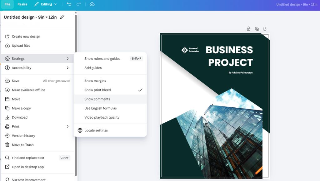
Bleed is the extra artwork that extends past the trim line. It's there so that if the cut shifts slightly during production, you don't end up with a white edge along one side of your folder.
- Bleed: Add 0.125” (⅛”) on all outer edges
- Safe zone: Keep all critical content at least 0.125” inside the trim line
- Anything in the bleed zone will be cut off, so don't put anything important there
To see your bleed area while you work in Canva, go to File > View Settings > Show print bleed.
Step 3: Design the Front Cover
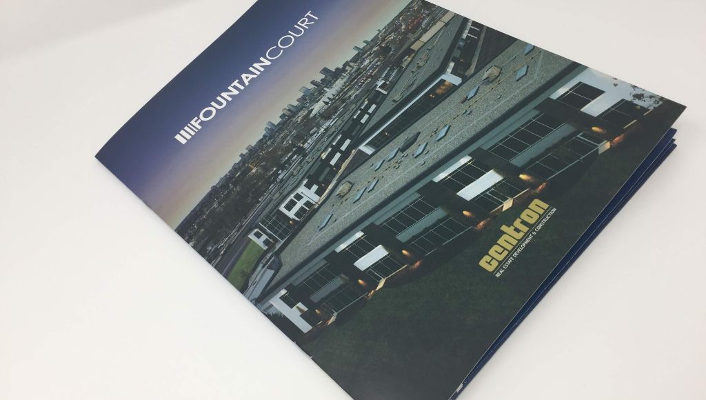
The front cover is the first impression, so keep it clean and purposeful.
- Place your logo in a clear, prominent position (upper left or centred are both common)
- Add a headline or tagline that communicates what you do or who you serve
- Use one strong visual if you're working with imagery; avoid competing elements
- Leave breathing room; a cluttered cover reads as unprofessional
Think about it like a hierarchy. You want your logo to register first, and your headline second. If someone can't scan the cover in a couple of seconds and understand what your business does, there's too much going on.
Tip: If you're stuck on copy, drop your business description into ChatGPT and ask for five headline or tagline options. Treat it as a starting point and edit from there.
Step 4: Design the Back Panel
The back panel is functional. It's where people look after they've reviewed the front, and they're usually looking for contact information.
Common back panel elements:
- Business name and address
- Phone number and email
- Website URL and/or QR code
- Social media handles
- A short tagline (optional)
Your back panel should be scannable. This isn't the place for extra marketing copy or a second round of brand storytelling.
Step 5: Design the Interior Pocket Panels
The interior is where the design gets a little more technical. A standard pocket folder has two interior panels (left and right) plus a pocket flap at the bottom of one or both sides.
What to know about the pocket zone:
- The pocket flap typically rises about 4” from the bottom of the interior panel
- Don't place critical content in the pocket zone; it'll be hidden behind the flap once the folder is assembled
- Your dieline will show you exactly where this boundary falls
The interior panels are a good place for a brand statement, a service overview, or supporting visuals. A common layout includes a short "why us" paragraph on the left panel and a product or service breakdown on the right. It gives the reader something to engage with while they're reviewing your inserts.
Step 6: Add a Business Card Slit (If Applicable)
If your folder includes a business card slit, you need to account for its placement in your design file.
- The slit is typically die-cut on the right interior panel, near the bottom
- Don't place text or imagery directly behind the slit area; it may be partially cut during production
- Your dieline will show the exact position of the slit
If you're ordering a folder with a business card slit from Little Rock Printing®, confirm this when placing your order so the correct dieline gets applied to your file.
Step 7: Choose Your Fonts and Colours
Consistency across all four panels is what makes a folder look professionally produced rather than pieced together.
- Stick to two fonts maximum, one for headings and one for body copy
- Use your exact brand hex codes or Pantone colours; don't approximate
- Minimum recommended font size for body copy is 8pt, though 10pt or larger reads much better in print
- Make sure there's enough contrast between your text and background; light text on a light background is a common print problem
Canva's Brand Kit lets you lock in your brand’s colours, fonts, and logos so they're accessible across every panel (and project). If you're on Canva for Teams, Brand Intelligence allows you to apply your full brand system across all panels at once.
Step 8: Export Your Print-Ready PDF
A file that looks great on screen can still cause production problems if it's not exported properly. Follow these simple steps to export your work from Canva.
Canva export settings for print:
- File type: PDF Print
- Tick "Crop marks and bleed" before downloading
- Colour profile: flag with your printer if CMYK conversion is required (Canva's export options vary by plan)
In Canva, go to Share > Download > PDF Print, then enable crop marks and bleed. This gives our team the reference marks needed to trim the file accurately.
Before you send anything, open the exported PDF and do a quick review:
- Bleed extends to all outer edges
- No text or logos are too close to the trim line
- All four panels look the way you intended
What to Put Inside Your Pocket Folder
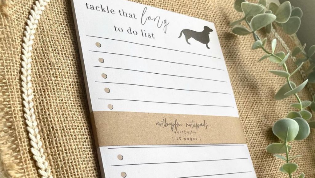
The folder is the container. What goes inside is what does the work.
| Insert Type | Common Use |
| Tri-fold or bi-fold brochure | Product or service overview |
| Business card | Contact information |
| Sell sheet | Single product or service detail |
| Price list | Quoted or tiered pricing |
| Notepad | Branded leave-behind |
| Case study or testimonial sheet | Social proof |
A good rule of thumb is don't overstuff it. Three to four inserts is usually the sweet spot. More than that, and the folder won't close cleanly, making people less likely to read everything anyway.
It’s always a good idea to plan your insert stack before you finalize your folder design. It helps you decide if you need a single-pocket or dual-pocket layout, and whether you should add a business card slit or a second pocket to keep things organized.
Ready to Print?
Once your file is set up and export-ready, Little Rock Printing® can take it from there. We print pocket folders in a range of sizes, finishes, and configurations, including dual pockets, business card slits, and specialty coatings.
Get in touch with our team or upload your file to confirm specs before sending. We're happy to review it and flag anything that might cause issues before it goes to press.