
Summary:
When you need to prepare high-quality print files, the important things to consider are resolution, colour settings, bleed setup, and correct export formatting. Designs that look sharp on screen can print poorly if files are prepared incorrectly, so using 300 PPI images, CMYK colour profiles, proper margins, and flattened PDF exports ensures reliable results across all of your marketing materials. Preparing your files right the first time prevents delays and saves you money on reprint costs.
Updated February 2026
| Time to Read |
|
| What You’ll Learn |
|
| Next Steps |
|
So, you’ve finally made that design that’s going to turn heads and spark imagination in anyone who sees it. That’s great! The next step is getting your design printed. But although printing may sound simple, there are many variables at play that can ultimately make or break your project if you aren’t careful.
To make sure you can get your design printed without distorting it or reducing the quality, we’ve created this guide on how to prepare perfect print files. Learn about image formats, color spaces, vectors, margins, and more below, then move forward with confidence that the finished product will come out exactly the way you want!
A Guide to Common Image Formats
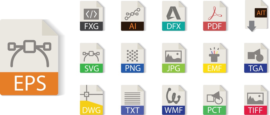
PDF, JPEG, PNG, TIFF… what do all these mean? For the uninitiated, formats may not seem important. As far as you can see on your computer screen, there is no discernible difference between different file types except for how your computer decides to open them.
However, small-but-important data differences occur in each different file type. For example, JPEG images are recompressed whenever they are saved, leading to a drop in image quality if it’s saved from computer to computer. Below, we’ve provided a quick overview of the major image formats and their pros and cons:
PDF (Portable Document Format)
- Pros: Retains formatting information across computers, ideal for document printing, maintains the visual integrity of designs.
- Cons: Not best for image editing, can have a larger file size.
JPEG (Joint Photographic Experts Group)
- Pros: Widely accepted and used, smaller file size, which is good for web.
- Cons: Loses quality with each save (lossy compression), not ideal for images requiring transparency.
PNG (Portable Network Graphics)
- Pros: Supports transparency, lossless compression, so retains quality.
- Cons: Typically larger file sizes than JPEG, not as universally accepted for print.
TIFF (Tagged Image File Format)
- Pros: High quality (no loss when printed), ideal for professional photo printing.
- Cons: Large file sizes, not web-friendly.
So what’s the best format for printing? Typically, PNG and TIFF are the best for printing images because of their superior compression systems. PNGs allow for transparent backgrounds that are great for logo designs, and TIFFs lose no quality when printed.
(Note that the above only applies to raster images. Vector images are different—don’t worry; we’ll explain all this in more detail later on!)
Meanwhile, PDF files are best for printing document files because they retain formatting information across computers. This allows them to be printed the way they were intended.
RBG & CMYK: What’s the Difference?
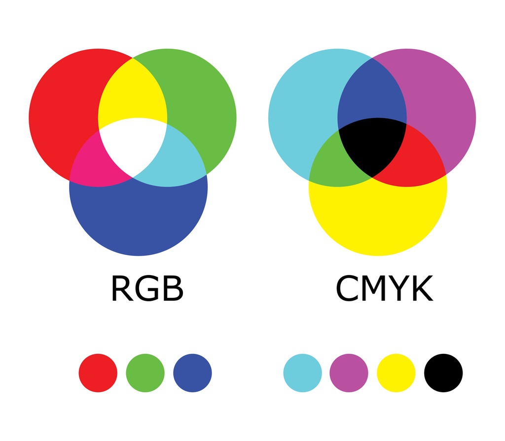
Now that you understand the importance of file types, it’s time to look at colour spaces and how they can affect your project. There are 5 types of colour spaces in general, but there are 2 that most designers work with: RGB and CMYK.
- RGB (red, green, and blue) is a colour space created to allow images to look the best on computer and television screens.
- CMYK (cyan, magenta, yellow, and black) is used for printing.
Before you head to the printers, it’s important to make sure you’re working in the CMYK colour space to ensure the colours you want are represented in the final product.
Images vs. Vectors: What’s the Difference?
Now let’s get into the differences between vectors and raster images.
Raster Images
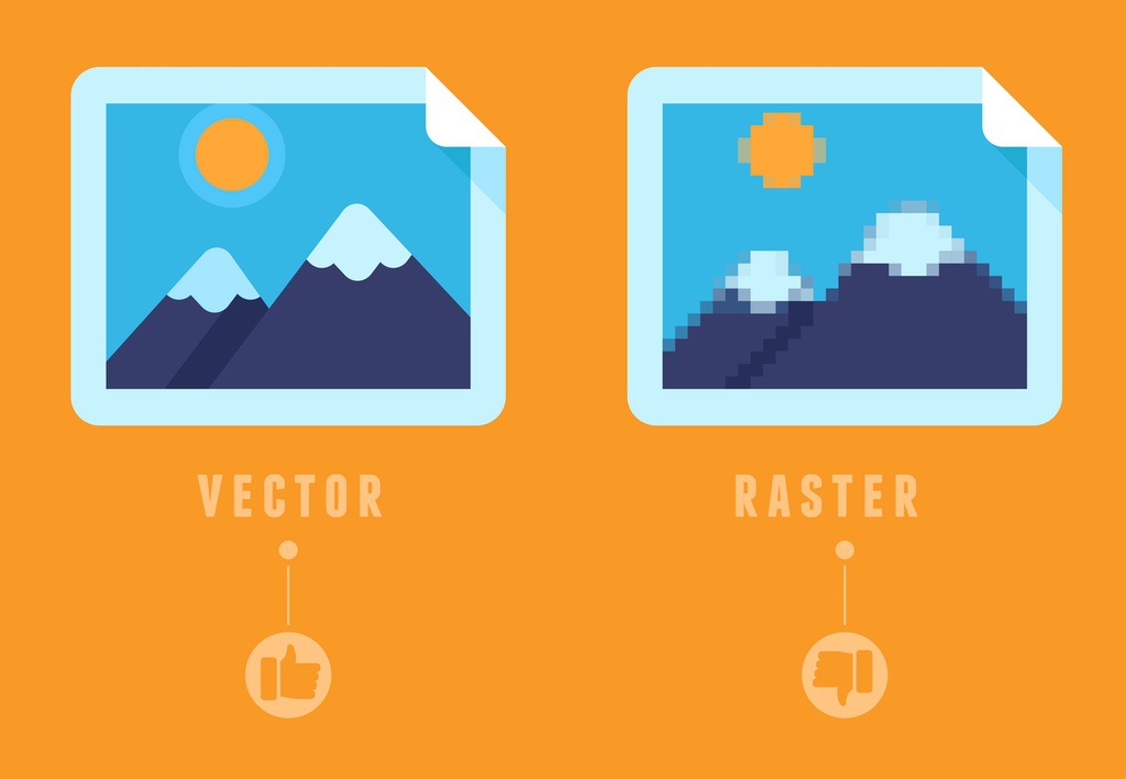
Most images are raster images. Raster images are created using thousands of pixels in different colours that ultimately creates the image. You can actually see the pixels when you zoom in closer to the project. Because these are made from pixels, you can run into a problem if you are upscaling your image to be larger than its original size.
If you’re planning on using a raster image, please make sure images are at least 300 PPI (pixels per inch) to ensure they’re the highest quality possible. You’ll also want to make sure they’re saved as PNG or TIFF files if possible.
Vector Images
Vector images are unique in that instead of pixels, they are created using shapes plotted along a mathematically generated path. Because vector images don’t use any pixels, they don't lose any quality when resized. Vector images are an excellent choice for printing logos, text, and line images like blueprints.
It’s also important to know that vector graphics have their own file formats; EPS and SVG are the most common. So don’t be frustrated if you’re wondering why you can’t save a vector as a TIFF or PNG—those are just for raster images!
Your Project: What Do You Need to Know?
Now that we’ve taken a look at some of the basics you need to know about file types, colour spaces, and image types, the next step is to set your project up for success at the printers.
For any project, you need to be aware of how and where your image will be printed on the page so it’s never cut off or distorted during the printing process. One of the ways designers can do this is by creating bleeds and margins.
What Are Bleeds & Margins?
Bleeds are used when you want an image to “bleed” over the edge of your print. Without a bleed, there’s a possibility your print can have a thin white space between the edge and your image. When you’re creating your design, please ensure your bleed is at least 0.125″ on all sides of your print.
Margins are the spaces between your image and the edge of the printed page. By making sure your image is within the margins, you can help protect it from being cut off by the page’s edge during the printing process.
What Kind of Paper Do You Need?
The type of paper you use can make all the difference to your project! Paper can come in a variety of sizes, weights, and coatings. The type of paper you use can make a difference in how it is perceived by the audience. For example, if you’re printing a business card, you may want to look at heavier paper types with a glossy finish.
If you’re not sure what type of paper is right for your project, consider ordering one of our free paper sample kits! These contain a full catalogue of all the different paper options available from Little Rock Printing™ (plus stickers, poster board materials, and banner textiles), so that you can plan your project as efficiently as possible.
Best Practices for Exporting Your Design
Before you head to the printer with your order, take a look at this checklist:
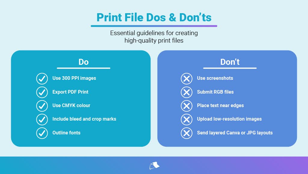
- Create your project using the CMYK colour space
- Make sure your raster images are 300 PPI
- Make sure your margins and bleeds are correct for your project
- If you’re printing a PDF, make sure the document is in pages, not spreads (this makes it easier to print)
- Use the highest quality file available
- Make sure your file types are correct for the type of image you want to print
- Zip all of your projects documents, including fonts, images, and the actual design document itself, into one accessible file
And voila, your project is ready to print! For further details regarding the printing process or personalized recommendations regarding your project, please contact Little Rock Printing™ today and speak with a member of our team. You’ll also find handy answers to the most common questions we get about prepping print-ready designs below.
Frequently Asked Questions About Creating High-Quality Print Files
What's the difference between lossless and lossy compression?
Lossless compression retains the image's quality, meaning no data is lost during the compression process. In contrast, lossy compression reduces the file size by removing some data, which can lead to a loss of quality.
Is there a noticeable quality difference between RGB and CMYK when printed?
While RGB is optimized for screen display, CMYK is designed for printing. Printing an RGB file can lead to color discrepancies, so it's always recommended to convert your file to CMYK before printing.
Can I convert a raster image to a vector?
While there are tools and software that can "trace" raster images and convert them to vectors, the result may not be perfect and might require manual adjustments. It's always best to start with a vector format if possible.
How can I ensure the colors on my screen match the printed colors?
Screen calibration and using a color-matched workflow can help. Additionally, requesting a printed proof before the final print run can allow for any necessary color adjustments. You can get a free proof of any design you’re printing with Little Rock by placing an order for a single unit and entering the code “FREEPROOF” at checkout.
Are there other color spaces besides RGB and CMYK that I should be aware of?
While RGB and CMYK are the most commonly used, there are other color spaces like LAB and HSB. However, for most print projects, focusing on RGB and CMYK will suffice.
What's the importance of zipping all project documents, including fonts and images, into one file?
Zipping ensures that all the necessary files are bundled together, making it easier for us to access everything we need. Including fonts ensures that your design maintains its intended look, even if we don’t have that specific font installed on our computers.


